


APIFERA
INDUSTRY: Beekeeping
SCOPE: Logo, Branding, Packaging
YEAR: 2024 – 2025
Apifera is a brand that merges beekeeping tradition with a modern approach to packaging and visual communication. Our collaboration aimed to revitalize its identity with a focus on naturalness, innovation, and freshness. We created a brand image defined by elegance, simplicity, and visual consistency — ready to conquer the market with “health in a jar.”
LOGO
The Apifera symbol draws inspiration from the geometry of bees and honeycombs, stylized in a clean, modern way. Hexagonal shapes are integrated into a symmetrical motif, supported by a clear and refined typeface — creating a logo that feels both sophisticated and authentic. We built a complete visual system: logo, patterns, fonts, color palette, and adaptable applications for all brand materials. The palette includes forest green and honey yellow — a warm, natural contrast directly inspired by nature.

BRANDING
The visual identity reflects the brand’s essence: natural, fresh, and trustworthy. The design is clean and breathable, using organic motifs inspired by honey, plants, and natural flow — subtly complemented by traditional Moldovan patterns. Typography is warm and readable, while the color palette balances earthy tones with vibrant accents to aid differentiation. Graphic elements are scalable and versatile, easily applied across packaging, promotional materials, and digital media.


PACKAGING
The packaging and labels were designed to be visually attractive while clearly communicating product differentiation — from acacia and linden honey to wildflower blends and infused creams. We created a premium packaging series with delicate illustrations and unique colors for each variety. Attention to detail shines in every element: stylized honey drops, well-balanced fonts, high-quality printing, and precise layout. Each jar becomes a storytelling tool — expressing purity, origin, and a deep care for health and nature.


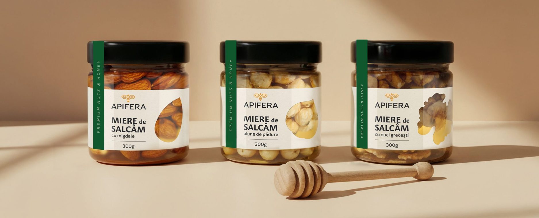
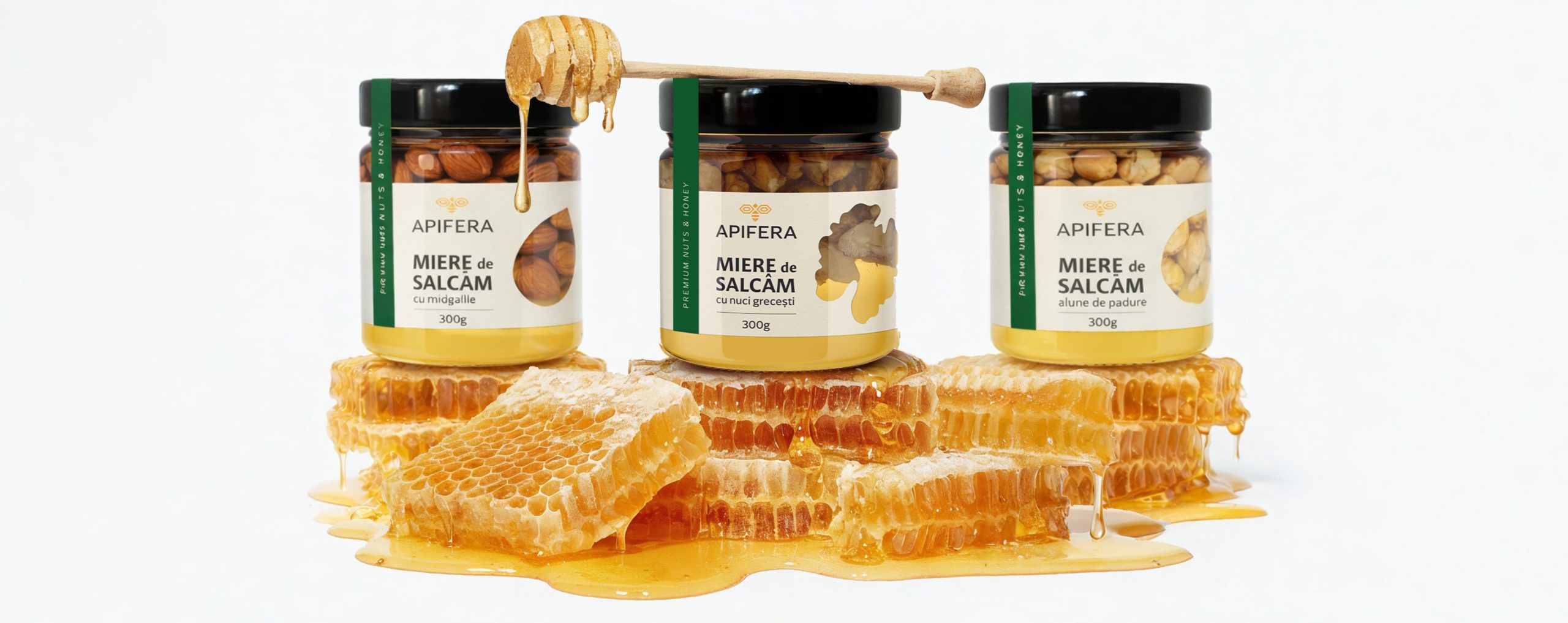
PACKAGING - Honey with Nuts
INDUSTRY: Beekeeping
SERVICES: Packaging Design
YEAR: 2025
For APIFERA, we expanded our collaboration by developing packaging design for new product lines: honey with nuts and functional snack bars made with honey, fruits, and natural ingredients. Following the logo and branding development, the packaging stage focused on strengthening the premium positioning and ensuring clear shelf differentiation.
The packaging design for the honey with nuts range emphasizes natural quality, clarity, and strong readability. The label is built on a clean structure with a well-defined information hierarchy and graphic elements derived from APIFERA’s visual identity.
Organic shapes and product illustrations highlight the real ingredients, reinforcing the perception of authenticity and premium quality. The visual system is scalable across multiple honey and nut combinations, maintaining brand consistency and strong shelf recognition.
The result is a honey packaging design that communicates transparency, quality, and natural origin, suitable for both modern retail and specialized distribution.
PACKAGING - Honey Snack Bars
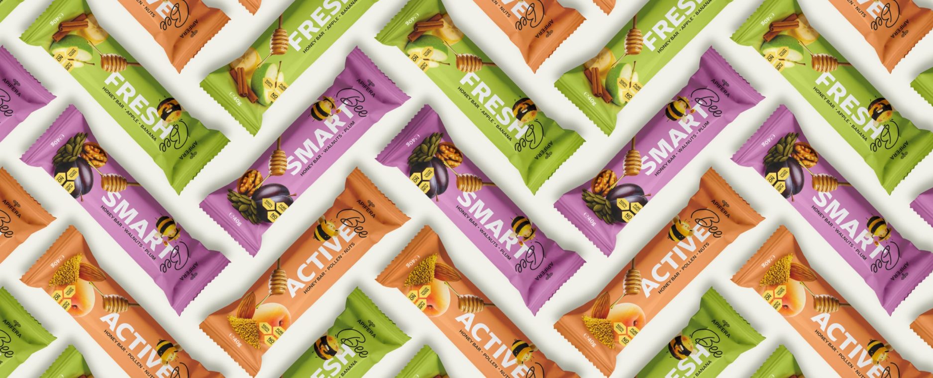
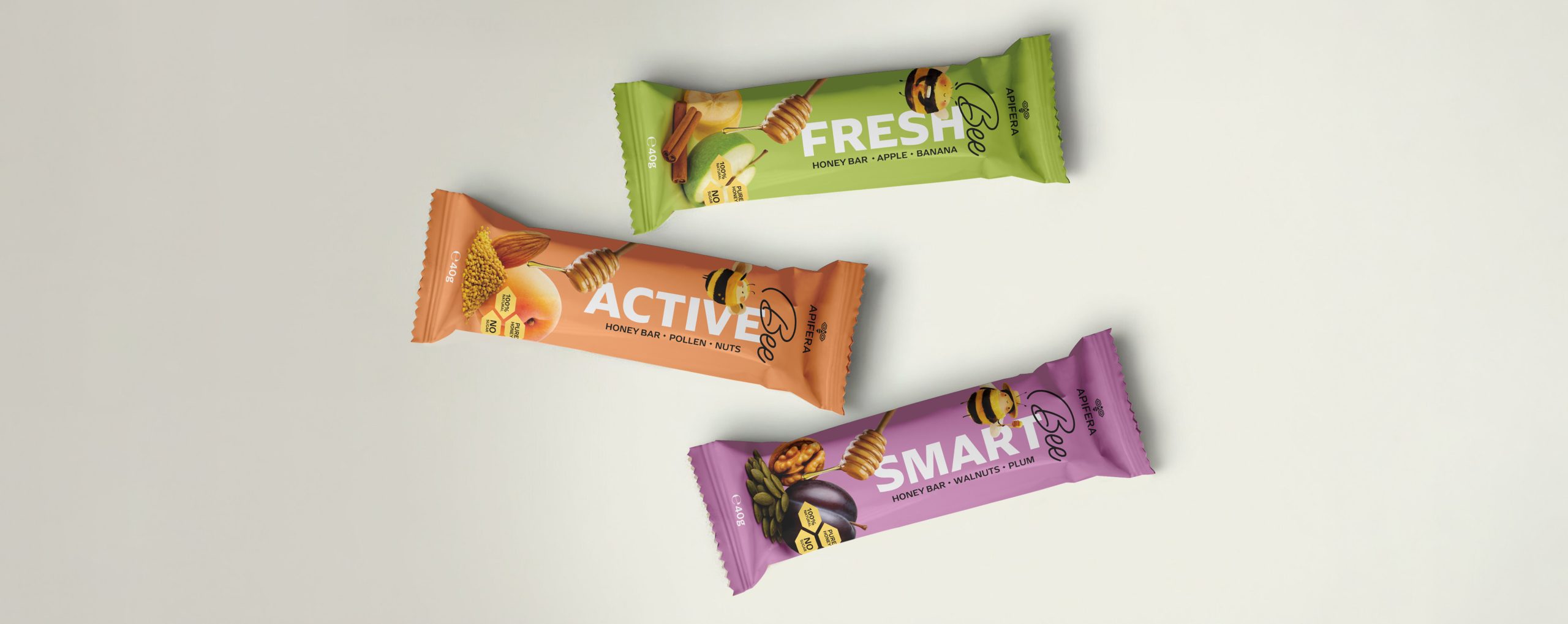
For the APIFERA snack bar range, we developed a more dynamic visual direction, aligned with everyday and on-the-go consumption. The packaging design clearly differentiates each flavor through distinct color coding, expressive illustrations, and a vertical graphic structure with strong shelf impact.
Visual elements highlight key ingredients and product benefits, supporting positioning within the natural snacks and honey-based energy bar category.
The packaging conveys energy, freshness, and natural quality while maintaining consistency with APIFERA’s brand identity.